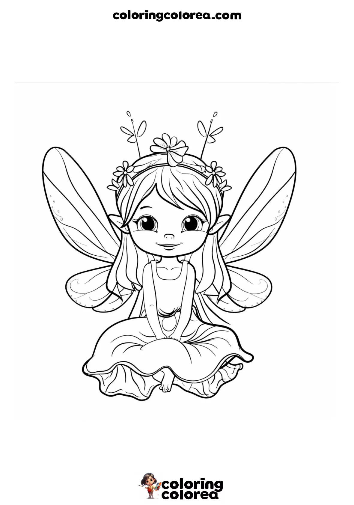
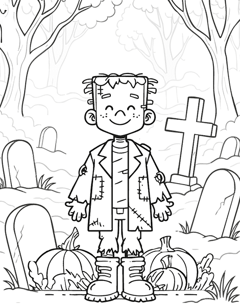
At first glance, this drawing might seem simple — but there’s a lot more going on beneath the surface. Artistically, it’s packed with little details that make colouring it in genuinely fun… and just a little bit challenging too.
At first glance, this drawing might seem simple — but there’s a lot more going on beneath the surface. Artistically, it’s packed with little details that make colouring it in genuinely fun… and just a little bit challenging too.
Format: A4 21x29,7 cm
Difficulty: Easy
Categories: Halloween
Tags:
Artificial Intelligence: Some images and texts have been created using Artificial Intelligence. However, all of them undergo a process of control and photographic retouching, vectorization and/or redrawing that makes them unique and safe.
Logos and Trademarks: Logos or company names are used for identification purposes only and may be trademarks of their respective owners
Licence: The generated images are in the Public Domain but are licensed under CC BY-NC-ND 4.0.
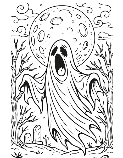
Let’s start with the background: the moon takes up a large portion of the space and instantly draws the eye. To keep it looking full and bright, go for soft shades — white, pale grey, maybe even a hint of gentle yellow. The key is not to overdo it with colour. Instead, use light shadows around the edges to give it depth without losing that glow.
The clouds and night sky? They’re the perfect place to play around with gradients. A nighttime sky isn’t just dark blue — it can be purple, deep teal, or even have a touch of eerie green if you’re going for a proper Halloween vibe. Blending pencils or using soft smudges can really help create that rich, layered look.
Now, the dead trees and bats — those are drawn with sharp, defined lines. This is where you can go bold with solid blacks or mix it up with dark tones (try black with a hint of violet for something a bit moodier). Just be careful: if everything turns too dark, it can start to feel flat. Balance it out with brighter touches elsewhere.
And the pumpkin? That’s your showstopper. Feel free to have fun with it. Classic orange always works, but if you’re in the mood to experiment — why not try fuchsia or lime green for a quirky twist? Whatever you choose, make sure it stands out against the gravestones, which tend to look best in greys or earthy browns.
This drawing gives you the chance to explore light, shadow, and contrast. It’s a great little project if you’re just starting to push your colour boundaries and want to practise finding visual balance.