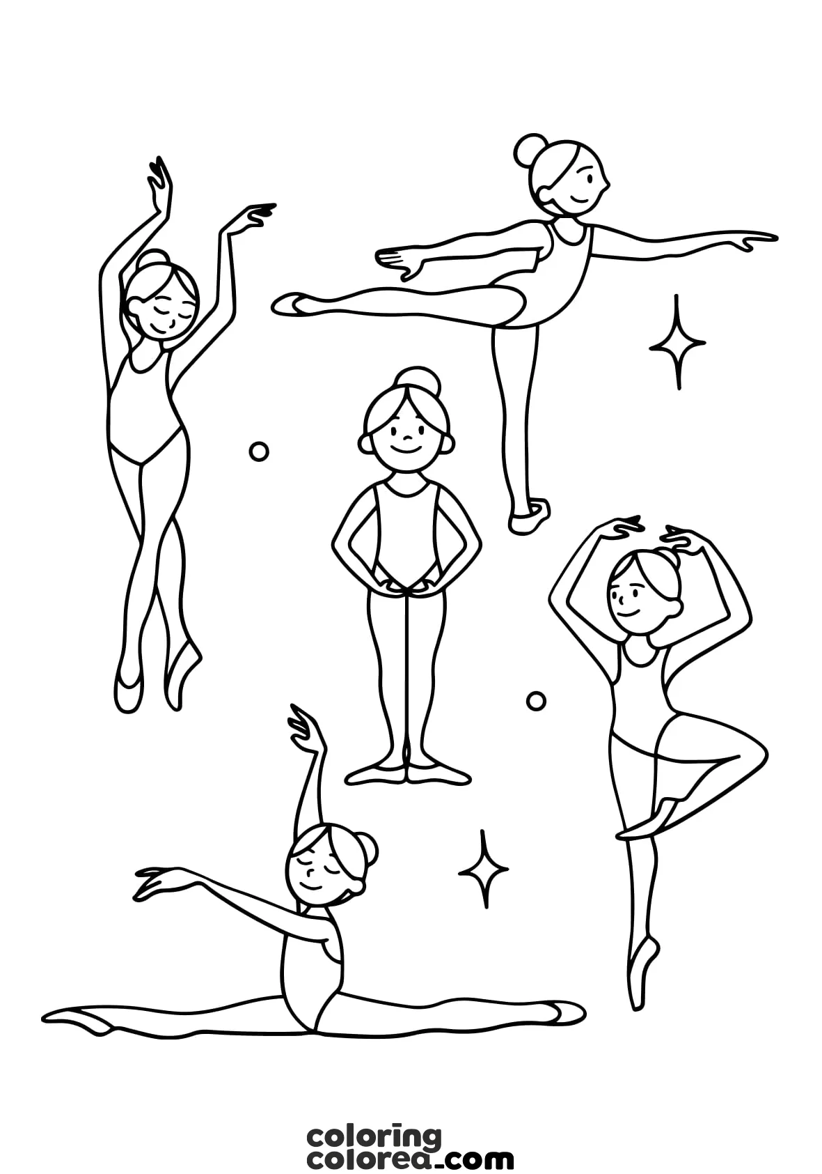
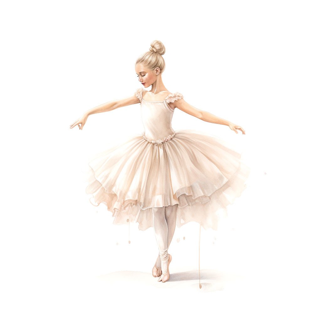
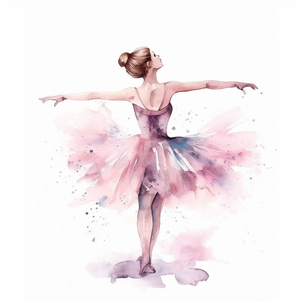
Tips and Techniques for Coloring a Ballet Dancer
- Skin: Start with a light base tone—something gentle like pale peach, beige, or soft brown depending on the skin tone you want to create. The key is to work softly at first. Then, add shadows where the light naturally wouldn’t hit: the sides of the neck, under the arm, between the shoulder blades, behind the knees, around the ankles. To soften everything and make it feel more lifelike, use a white pencil or blender pencil to melt those colors together just a bit.
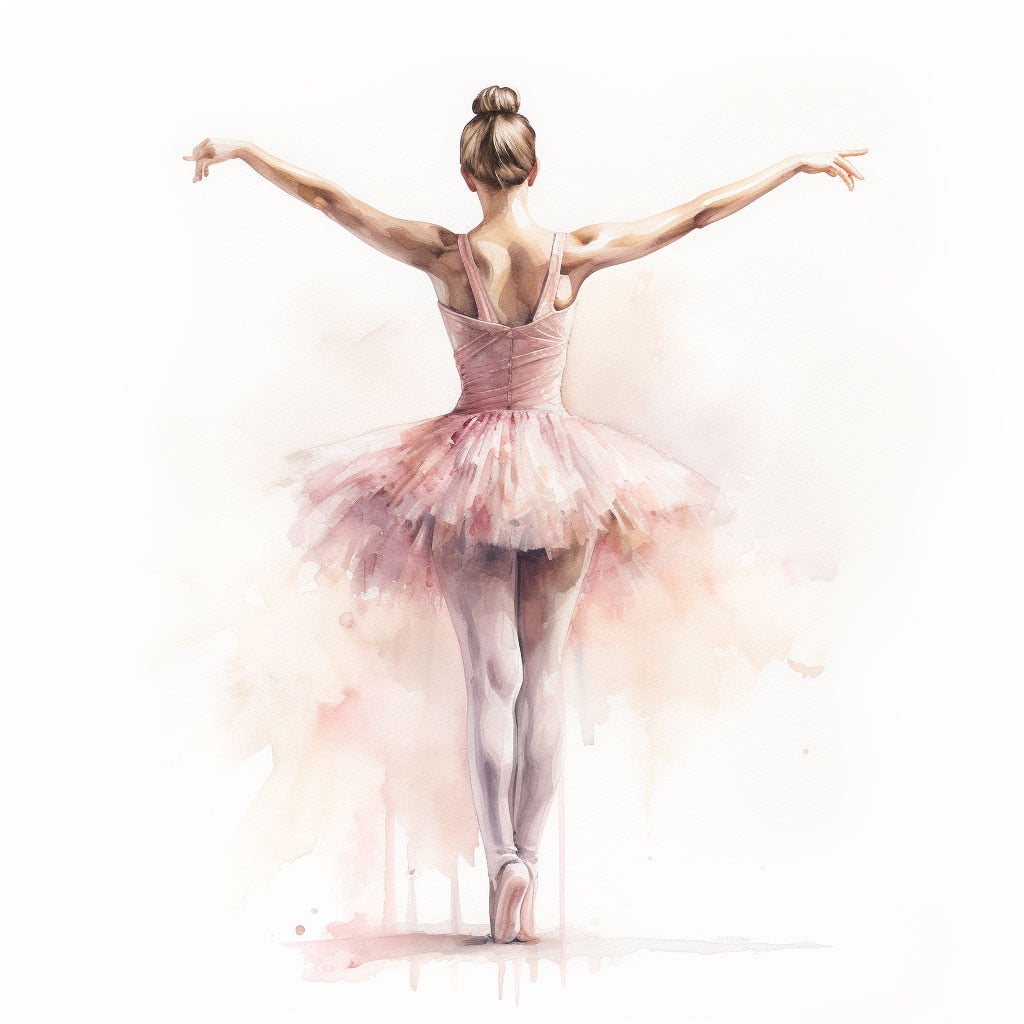
- Tutu: Now, this part can be tricky—but also really satisfying. Choose a delicate base: white, pale pink, light blue, or lavender all work beautifully. With a soft gray or a slightly darker version of your base color, draw thin, fan-like strokes to build the layers of tulle. Try to follow the circular motion of the skirt. Think of how a real tutu flutters slightly in the air. Blend the top part gently to create that see-through, floaty feel. You’ll start to see the fabric come alive.
- Leotard or Corset: This is where you can have a bit of fun. Go pastel for something soft and traditional, or add contrast with a deep plum, navy, or even black. To make the torso look more three-dimensional, shade along the sides and just under the chest. Use a gentle touch—layers of color are your friend here. That way, you won’t lose the shape of the dancer’s body beneath the color.
- Pointe Shoes: Soft pinks, satin white, or beige are classic choices here. Add shadows where the fabric folds, at the base of the shoe, and where the ribbon hugs the ankle. Want to give them that elegant sheen? A white pencil or a small stroke of white gel pen can mimic the glossy satin finish.
- Hair: Go for warm browns, golden blondes, or even deep black depending on the mood you want. Start with a flat base, then add fine strokes in the direction of the bun or braid. Think about how light hits hair: a few subtle highlights with white pencil or blender will make it look soft and dimensional.
- Background and Shadows: A little detail here goes a long way. Use a neutral gray to draw a soft shadow on the floor—it helps ground the figure. If you’d like to suggest a stage setting without pulling too much focus, try a vertical pastel gradient in the background. Something like light lavender fading to soft pink or blue can evoke the stage lights without taking over.
⸻
A Note on Difficulty
Honestly, this drawing isn’t the easiest. The hardest parts? Getting the proportions of the body right, capturing the softness of the hands, and giving the tutu that light, airy look. But don’t worry—those are exactly the parts where you’ll grow the most. Realistic coloring here means thinking about volume, light, texture… and learning not to be afraid of layering color gently.
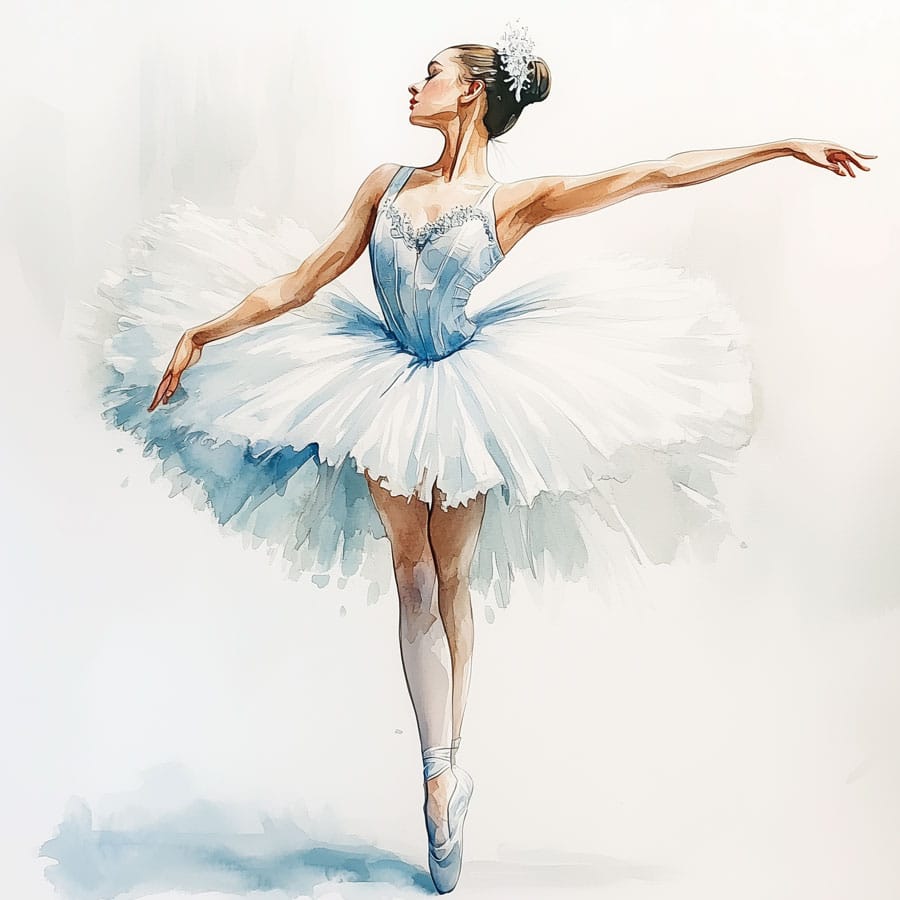
About the Pose – A Slightly Altered Arabesque
- Her weight is on one leg, standing en pointe (up on the toes).
- The other leg stretches out behind her, long and elegant.
- One arm reaches forward; the other lifts gracefully overhead.
- Her head turns forward, her gaze calm and focused.
It’s a quiet moment of tension and beauty—right before the next movement.
⸻
What You’ll Learn by Coloring This Drawing
- How to work with human proportions—especially feminine figures.
- Techniques to create fabric textures like tulle and satin.
- How to shade softly to create body volume without harsh lines.
- How to blend color transitions for a natural, realistic effect.
- And how to refine your control in delicate areas like the hands, the feet, and the subtle curves of a face in profile.